I have a background in photography and a lot of experience in the wide world of printing. Though that might sound boring - it actually is useful knowledge when approaching design.
Have you ever created a file in Photoshop, saved it, and then uploaded it the web only to have your colors suddenly turn garish and not what you planned for? Well, so have a lot of people. Want to know what’s wrong? You’re not in the right color model.
RGB and CMYK are the two most common color models you will be using. I’m going to break them down in this post – but first a little bit about setting up your document in Photoshop or Illustrator.
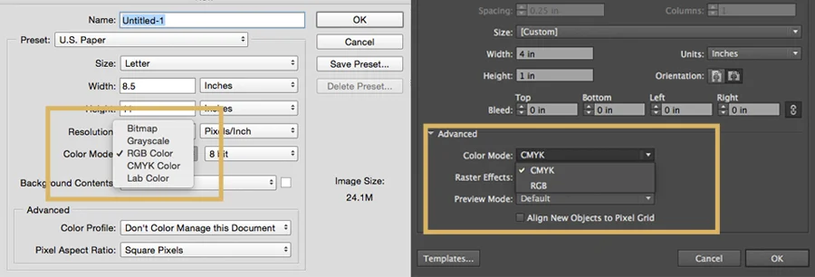
In Photoshop and Illustrator you can choose which color mode you want in the new document dialogue box (pictured below). You can also easily switch color modes if you realize you are in the wrong one. Be cautious in Photoshop if you do that, though, because the default settings will be to flatten your layers, which you probably don’t want!
To change an already existing document in Photoshop go to Image>Mode on the top and then select which you want. In Illustrator go to File>Document Color Mode (near the bottom).
RGB
RGB stands for Red, Green, Blue and it is considered a light additive color model. This means that colors are added together to produce lighter colors and eventually to produce white. RGB is specific to digital design - and if you are viewing anything with light behind it (your television, cell phone, computer, etc.) you are viewing RGB colors. If you are a designer creating graphics for web - you must be using RGB (or things will look really weird)!
Something to be wary of - computer screens need to be calibrated (and pretty often, too) if you want to be able to ensure uniform color quality. This is especially important for photographers who want good skin tone in their pictures, and even for designers that are trying to match colors to already existing materials. For calibration, I use Spyder.
Another thing to keep in mind (and potentially educate your clients about) is that because your screen is calibrated, and theirs is not, they might not be seeing what you are truly creating. I’m not saying to force your client to go buy software or anything, but just keep that in mind, in case the question ever comes up, so you can be prepared and have an educated response.
CYMK
CMYK stands for Cyan, Magenta, Yellow, and Key (Black) and it is considered a subtractive color model. This means that ink is removed to achieve lighter colors. You will often hear CMYK referred to as “four-over” or “four color process". This is because in printing you use all four colors layered over each other, as dots, to achieve different colors. This has to do with “DPI” or “Dots Per Inch” that you often hear about in printing. (Let me know in the comments if DPI is something you are interested in learning more about, I can do a lesson on that).
With CMYK You can’t produce a color lighter than the surface you’re printing on - so when you are seeing white, it’s actually not ink at all - it’s the surface of your paper. In the same idea - lighter colors just have less ink, so that more white surface shows through.
Black, on the other hand, is more complex. First, it has two options. You might have heard a printer ask, or seen in your print dialogue box, if you want “plain” or “rich” black. Plain black is simple black ink, whereas adding colors together creates “rich” black. The actual CMYK values for rich black are C=75%, M=68%, Y=67%, and K=90%.
The thing is, even with those percentages, not all blacks are considered equal. If you are printing something for yourself or a client, consistency is key, so make sure you are not interchanging blacks, or using different CMYK values to get to black. This will definitely show up in printing! Though, knowing this, if you wanted a cooler back you could up the percentage of cyan, or conversely if you wanted a warmer black, up the percentage of yellow.
CMYK is actually a process that dates back to before our newer fancy printers. If you’ve ever worked with screen-printing or a printing press, you know the idea of layering colors. Well, CMYK is what was used in the beginning of printing to achieve different colors. Why do we call the black “K”? Because it actually stands for the Key plate, which was the most important of the four plates as everything was aligned to it.
CONCLUSION
I hope that clears up any questions you might be having about the difference between the two color models. If you have any other questions feel free to ask in the comments, I’d love to help!

I’m Kaitlyn, your design assistant! I work with successful creative entrepreneurs to create cohesive, clean, and compelling visuals for their businesses. You can keep being the #girlboss you are (but with more time to focus on growing your empire)! Let's set up a time to chat!